UX / UI Design / Information Architecture
ASA Electronics
One platform, many brands
Overview
I led design for ASA Electronics’ web ecosystem: one WordPress multisite serving a corporate site, a support site, and a family of brand sites that sell into six industries.
The Challenge
Make many brands feel like one company without erasing what makes each brand distinct.
The Problem
Before this redesign, the sites weren’t built to sell. By 2023, that showed everywhere.
In 2020, every site was scoped as informational only, with online sales planned for Amazon. Weeks before launch, a change in sales strategy brought e-commerce back in-house. A WooCommerce store was added to asaelectronics.com under a tight deadline, and the launch slipped three months. That left a fragmented system:
- Every brand site was a separate WordPress build, and all purchases redirected to the ASA store.
- Links between sites broke often, and the navigation didn’t connect.
- Separate builds meant no shared analytics. Bounce rate was the only reliable number.
- Customers who knew one brand had no way to discover the rest of the catalog.
The complaints came from both sides. Customers regularly told customer service they couldn’t find manuals and materials on the sites. Customer service reps said the sites were hard for them to use, too.
Underneath all of it, ASA’s brands and industries don’t map one-to-one. Voyager sells into all six industries. JENSEN covers RV, marine, and heavy-duty equipment through three sub-brands. Every industry draws on at least two brands, so a single hierarchy couldn’t capture those relationships.
Role
Lead designer: UX, UI, navigation structure, design guides
Timeline
November 2023 to June 2025 launch (about 19 months)
Team
4-person in-house marketing team; agency partner and its offshore developers for the build
Scope
Corporate site, support site, and brand sites for JENSEN, Voyager, Polk Ultramarine, Klipsch Adventure, and more
Tools
Adobe XD, Photoshop, Illustrator, Miro
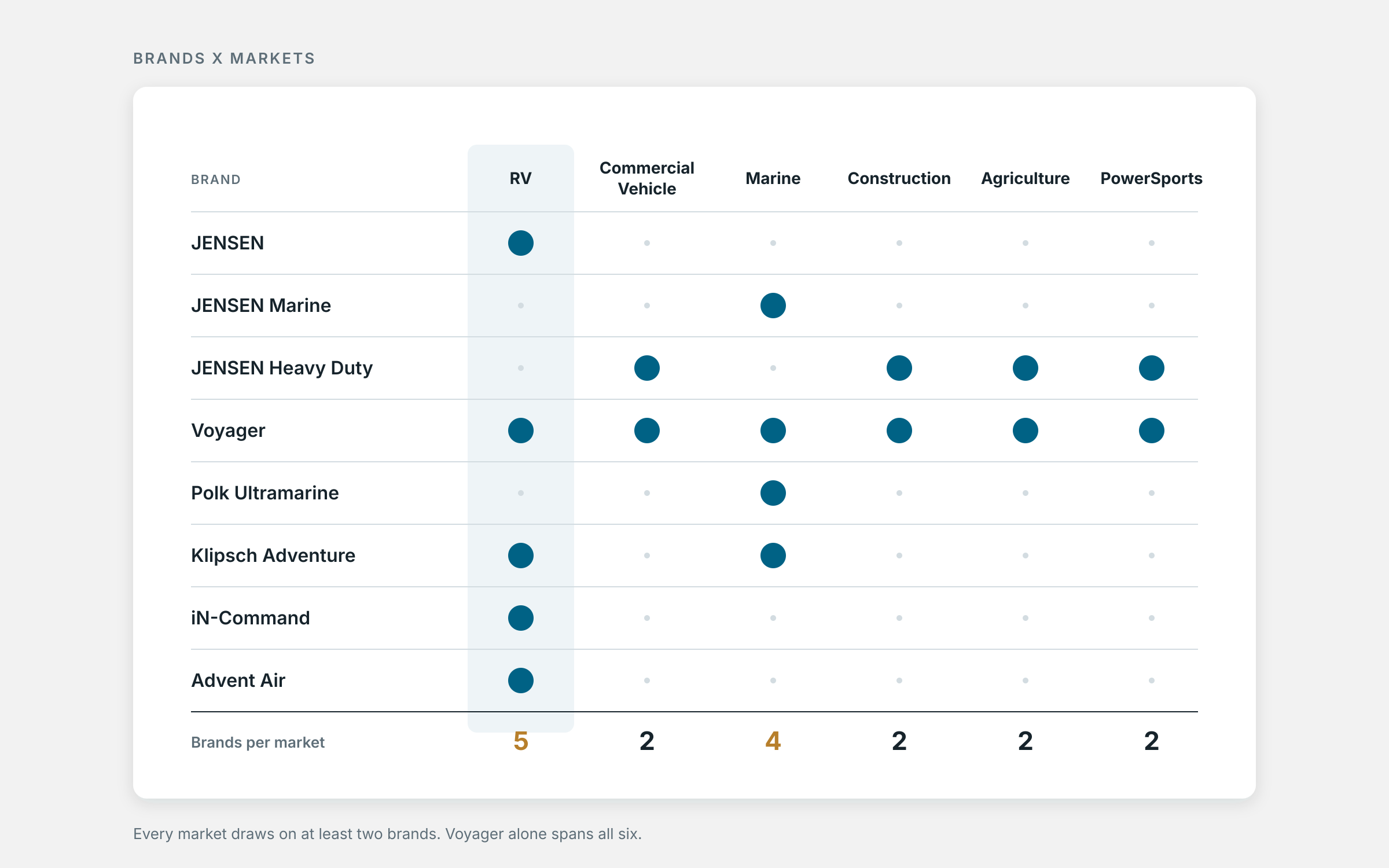
Brands X Industries Every industry draws on at least two brands, so no single hierarchy fits.
Two audiences pulled in different directions. Most of the business came from OEMs, the manufacturers that build ASA products into RVs, trucks, boats, and equipment. They ordered through sales reps and used the sites for product research, specs, and documentation. At the same time, ASA wanted to grow direct sales to consumers. One set of sites had to serve both. An OEM login portal with contract pricing was planned for a later phase.
A new marketing director joined in late 2021, and by 2023 the rebuild was taking shape around one idea:
One store, many storefronts. One WordPress multisite, one WooCommerce installation, and one database, with each brand site as its own window into the same catalog.
The rebuild had a second user to serve: our own team. ASA exhibits at more than 50 trade shows a year, and each one needed a landing page. The old sites ran on heavily customized templates, so every page was slow to build and hard to update. The new platform had to let marketing publish pages quickly without starting from scratch.
Constraints
I designed with tight limits, and they shaped every decision.
- Small team. I was the only designer, and I also handled video production for the company.
- Split ownership. Design came in-house as a cost-saving measure. Development, hosting, and the build stayed with our longtime agency partner and its offshore developers.
- Limited resources. Scope tradeoffs determined which sites got a full redesign and which did not.
- Competing priorities. Each industry division wanted its own products front and center. Part of my job was keeping the structure centered on the customer.
Decision #1: Industry First, Brand Second
Working with our marketing director and agency partner, I championed a structure where the brand anchors every site and the industry guides every shopping path.
Brand first means a customer always knows whose product they’re looking at, wherever they land. Industry second means they can shop by the environment they use it in: RV, Commercial Vehicle, Marine, Construction, Agriculture, or Powersports.
The mega menu puts this into practice.
- Industry. Hovering over Shop reveals a row of industries.
- Need. Each industry splits into Entertainment and Safety, because an RV owner thinks, “I want safety,” not “I want a Voyager product.”
- Category. Stereos, Speakers & Subwoofers, Observation Systems, and so on.
- Subcategory. Wired Camera Systems, Tire Pressure Monitoring, and so on.
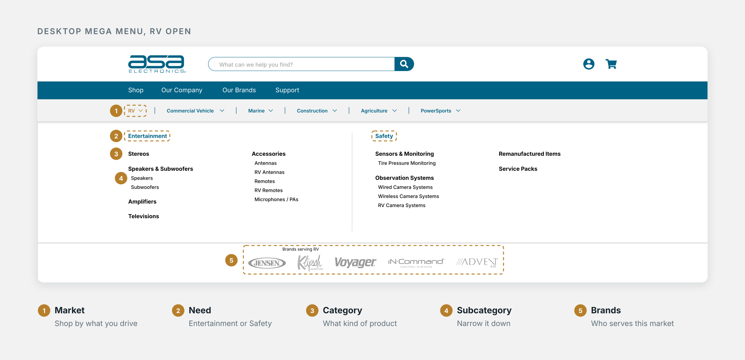
The Mega Menu Four levels on desktop. On mobile, three taps from Shop to reach category.
A row of logos along the bottom shows which brands serve that industry. Under RV, that’s JENSEN, Klipsch Adventure, Voyager, iN·Command, and Advent Air. It turns the overlap between brands and industries into something a customer can see.
Why it mattered: A Voyager customer shopping for commercial vehicle cameras could discover that Voyager also makes RV systems. I designed the structure to support discovery alongside product browsing.
The menu stays open across the full width of the navigation bar, so a diagonal mouse path from Shop to an industry doesn’t close it by accident.
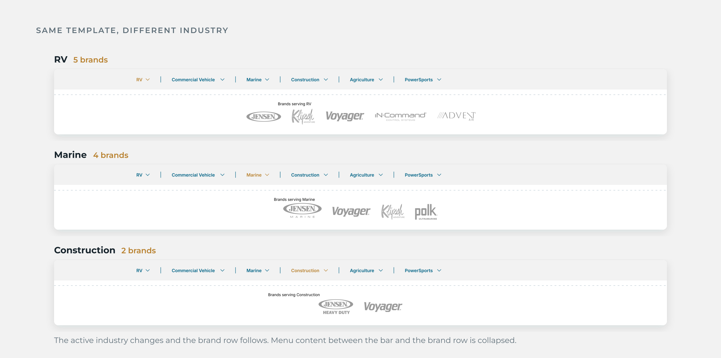
Same Template, Different Industry Four levels, organized around how customers shop, plus the brands that serve each industry.
Decision #2: One shared shell, a brand layer on top
Every site runs on the same navigation template, styled for its brand. The shared pattern gives users a familiar way to move between sites.
What every site shares:
- Header: Logo on the left, search in the center (“What are you looking for today?”), account and cart on the right, and primary navigation below.
- Footer: Brand logo, four navigation columns covering account, company, resources, and shopping links, followed by social links, the ASA parent mark, and a legal-link area. Column labels vary by site.
- Components: The image-and-text card, buttons, and link styles.
What each brand controls: Color, typeface, imagery, and the items in its primary navigation. Klipsch Adventure runs dark and uppercase. Voyager runs dark with copper accents. ASA stays light and corporate.
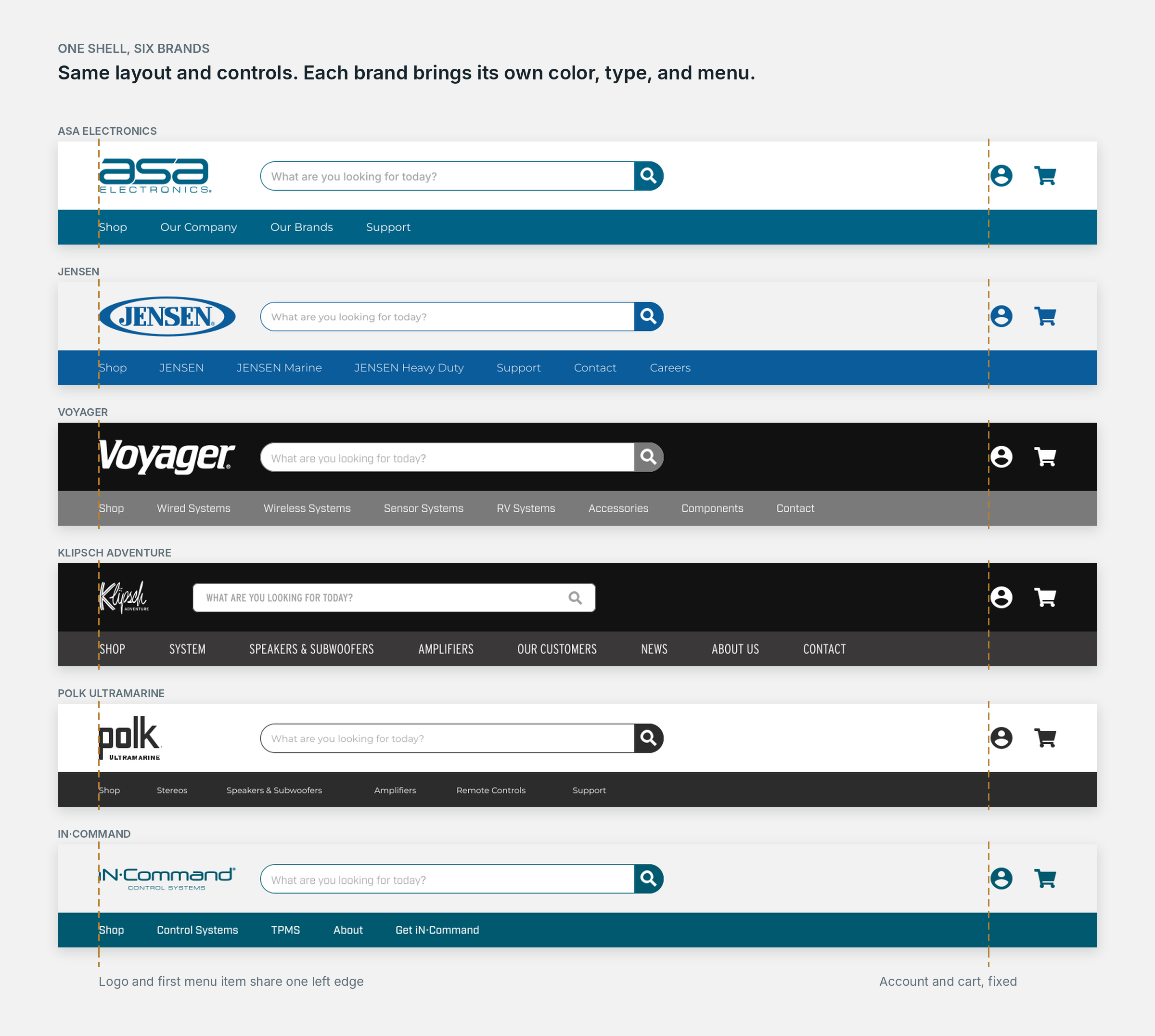
One shell, six brands Shared layout and controls. Each brand controls color, type, and menu items.
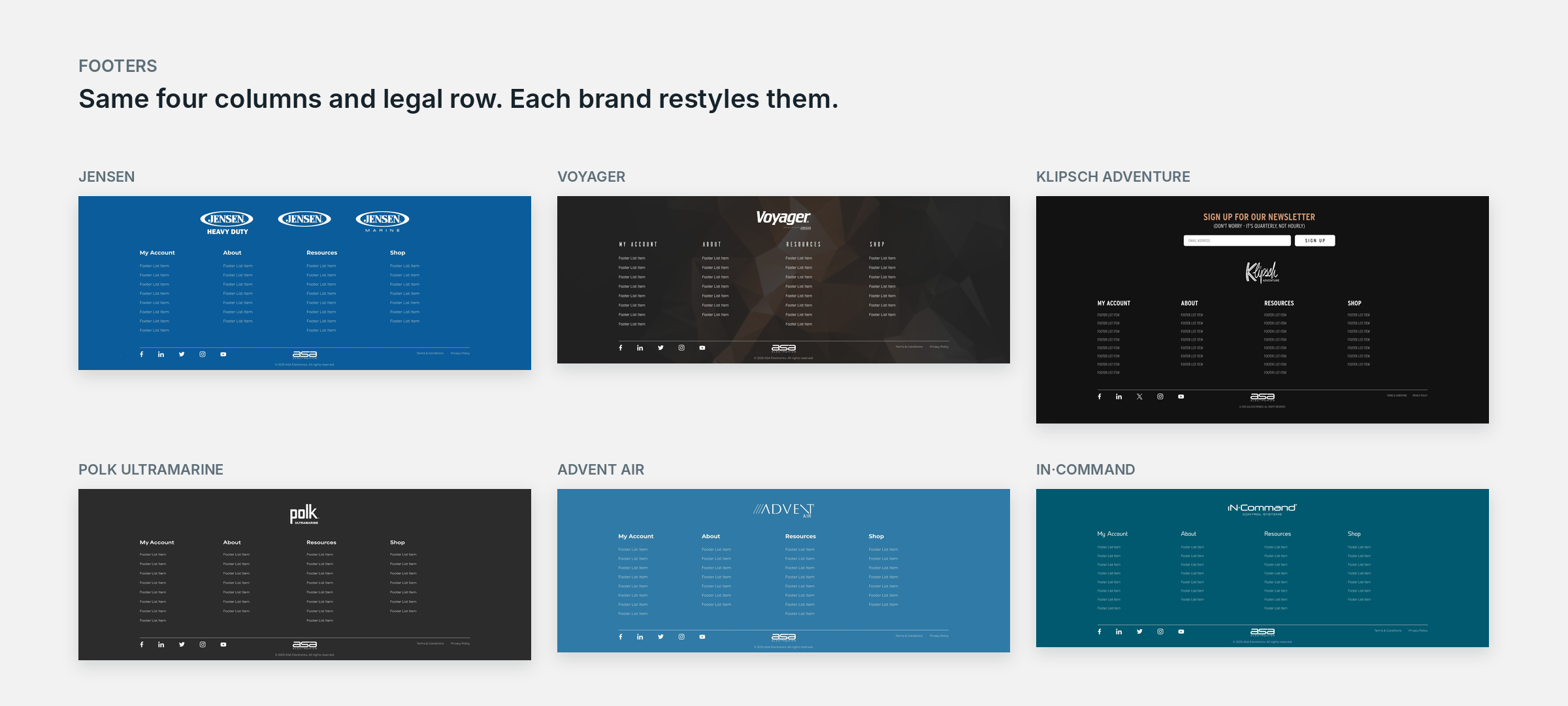
Footers Same four columns and legal row. Each brand restyles them.
Design guides as the handoff spec. With development handled by offshore developers I never met, the design guides were how I communicated my intent for the build. I wrote them for developers: a type scale in px and rem, a color palette, button anatomy with idle, hover, and active states, and a rule for what each link type is used for. The ASA corporate and support guides share one foundation, and the Klipsch Adventure guide adapts it for a separate brand.
Decision #3: A mobile navigation built for thumbs
A multilevel hover menu doesn’t work on a phone, so I designed separate mobile navigation instead of shrinking the desktop version.
- Each level slides over to the next without reloading the page.
- A back control at the top shows the parent level, such as Shop or RV.
- “View All” sits at every level for people who’d rather browse than drill down.
- The deepest level expands in place (+), so short lists don’t need another screen.
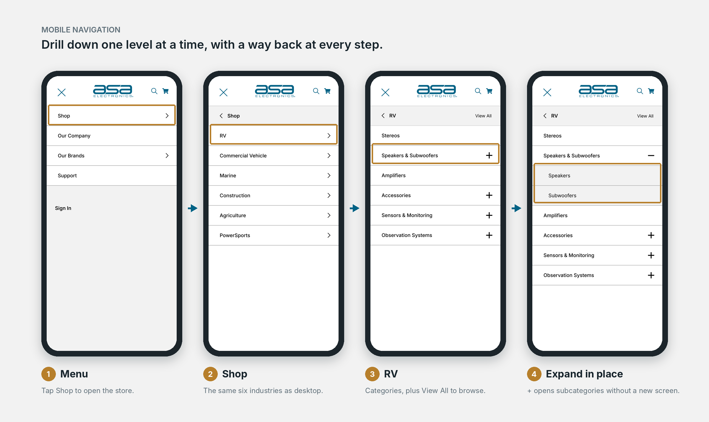
Mobile Navigation Four levels, three taps: the deepest level expands in place.
From Menu to Product
The navigation only works if every path lands somewhere useful. Here’s how a shopper gets from the homepage to a single product.
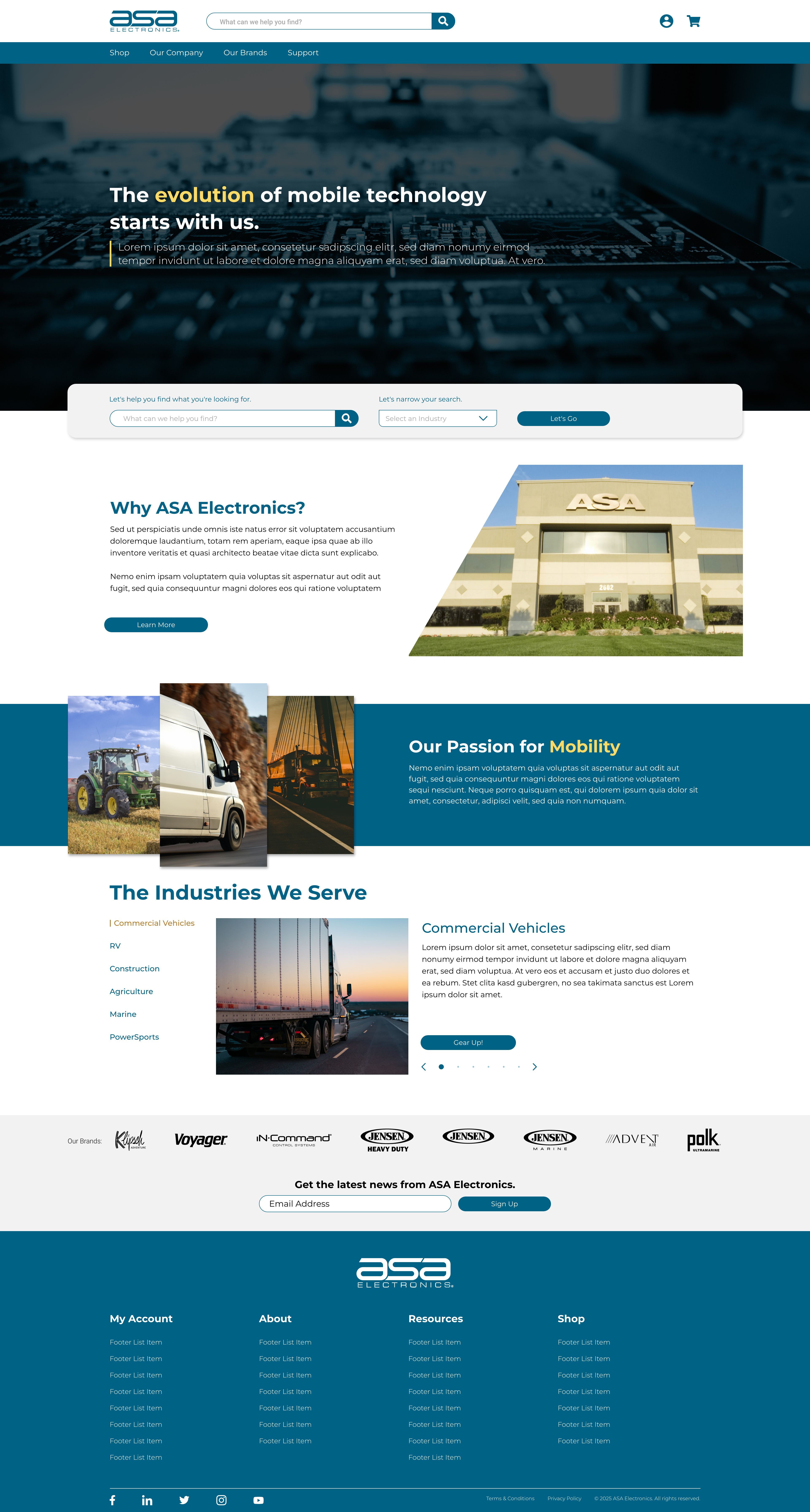
- Homepage. “Industries We Serve” puts the six industries up front, so a shopper can start from what they own before they know which brand they want.
- Mega menu. Shop, then an industry, then a need and a category. The brand logos underneath show which brands serve that industry.
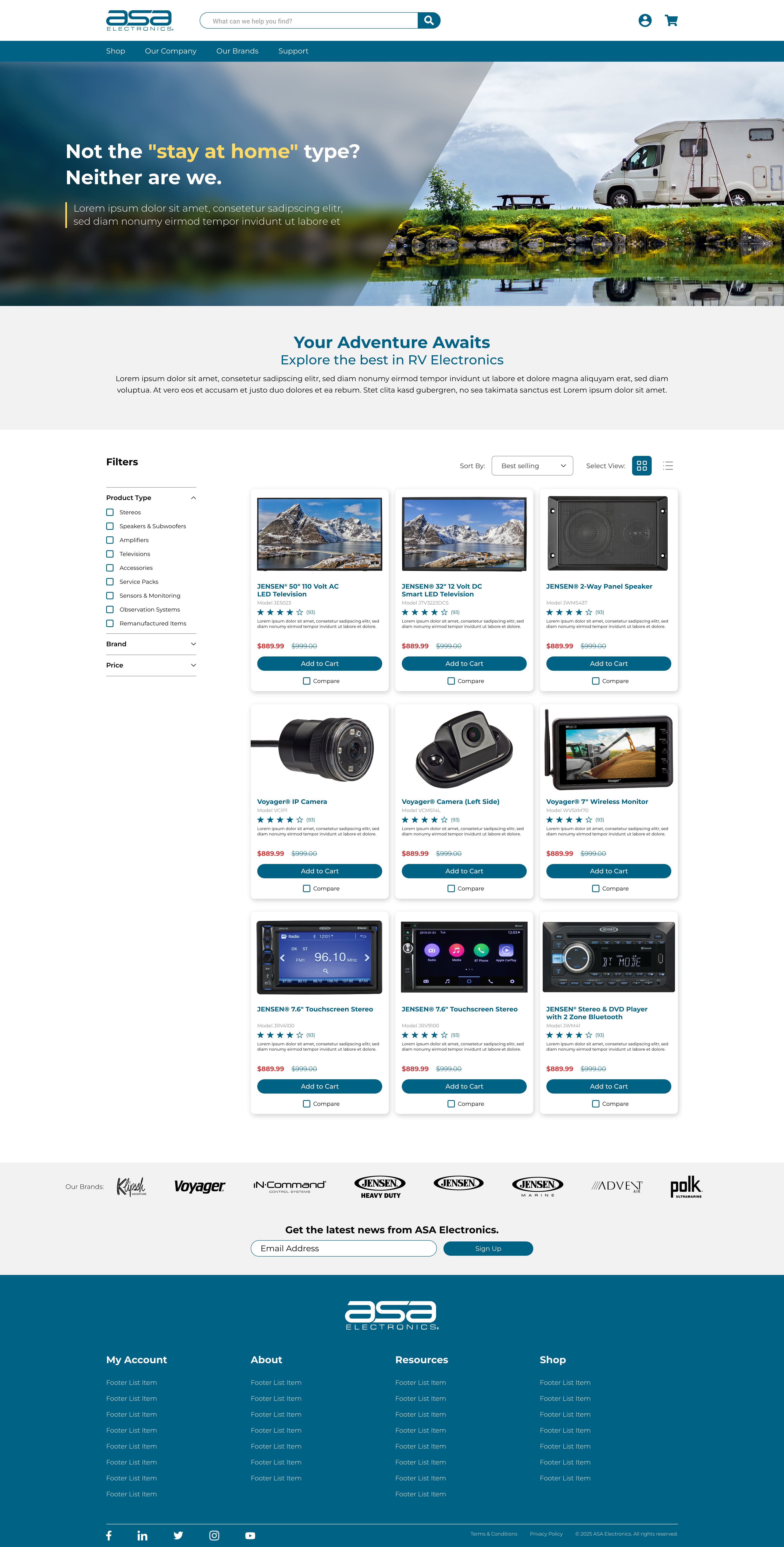
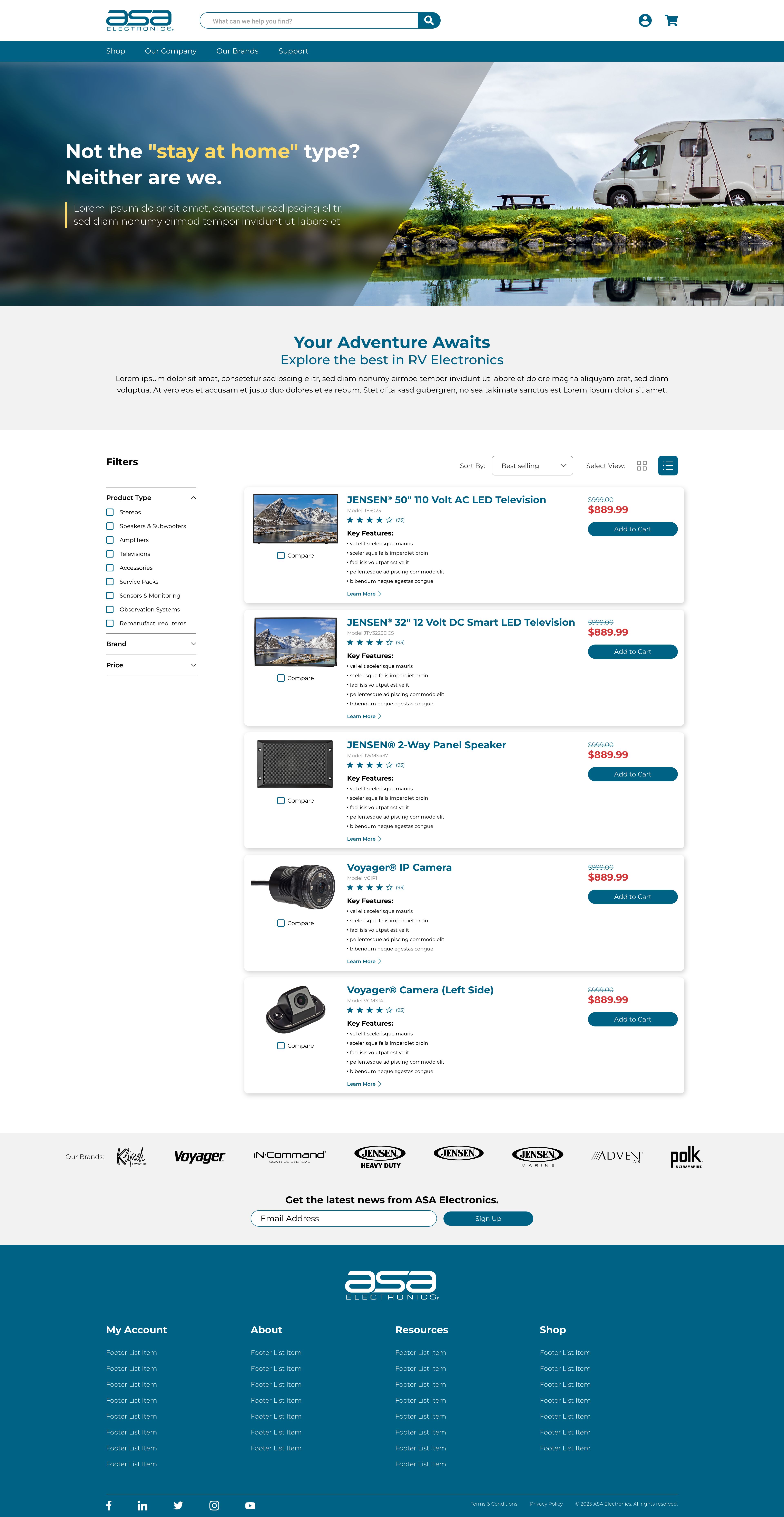
- Division page. Each industry has its own product listing. A brand filter narrows results within the industry, so the cross-brand view stays the default and a single brand is one click away.
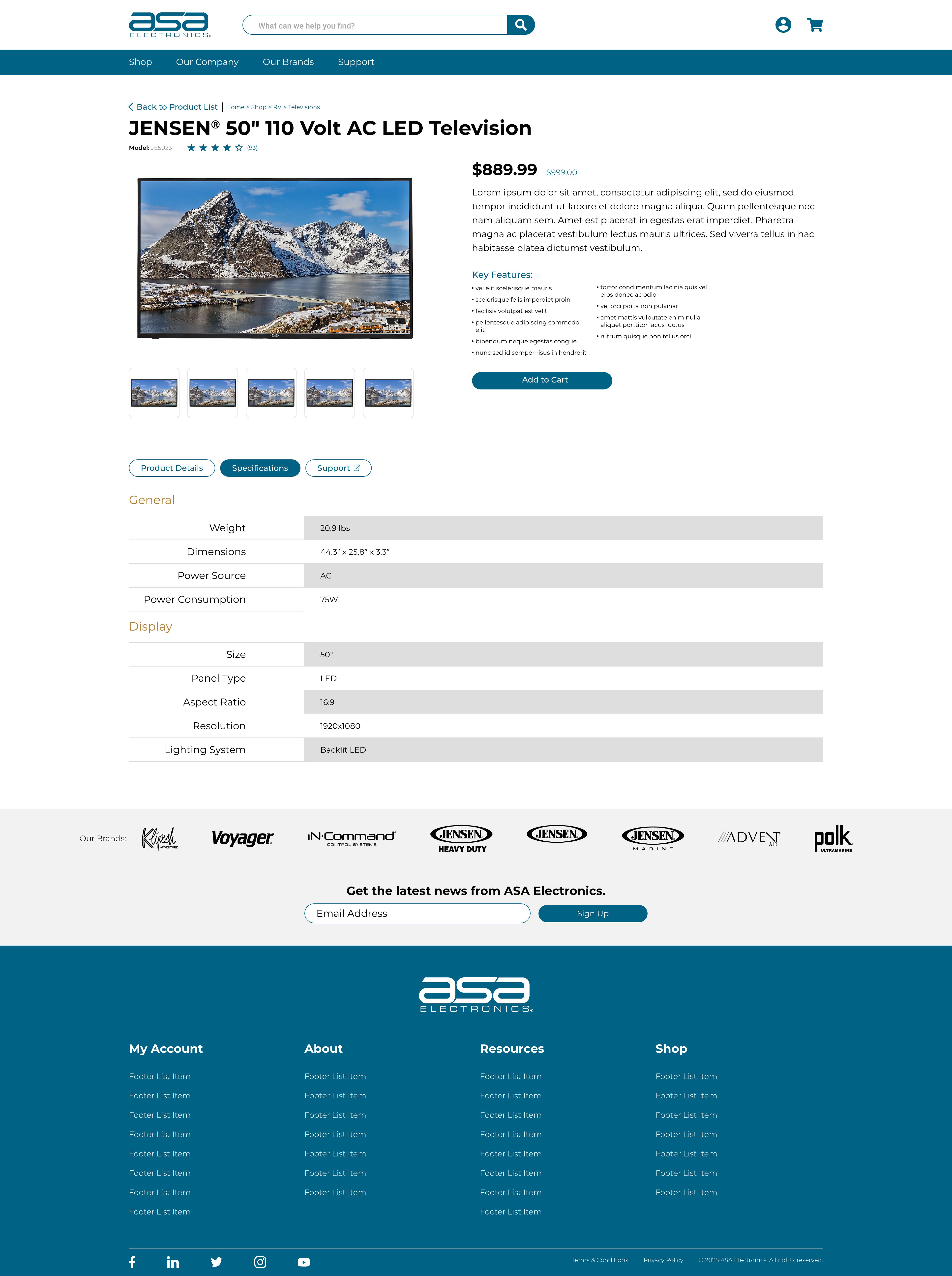
- Product page. A breadcrumb shows the path back through the industry and category. Product Details and Specifications tabs keep the page short. The Support tab carries an external-link icon and opens the support site, so manuals, downloads, and help live in one place instead of on every brand site.
Grid or list, the shopper’s choice. Division pages offer both views. I wanted to meet customers where they are: a dealer or OEM buyer scanning model numbers and specs in a list, or a consumer browsing product photos in a grid. Same products, same filters, two ways to read them.
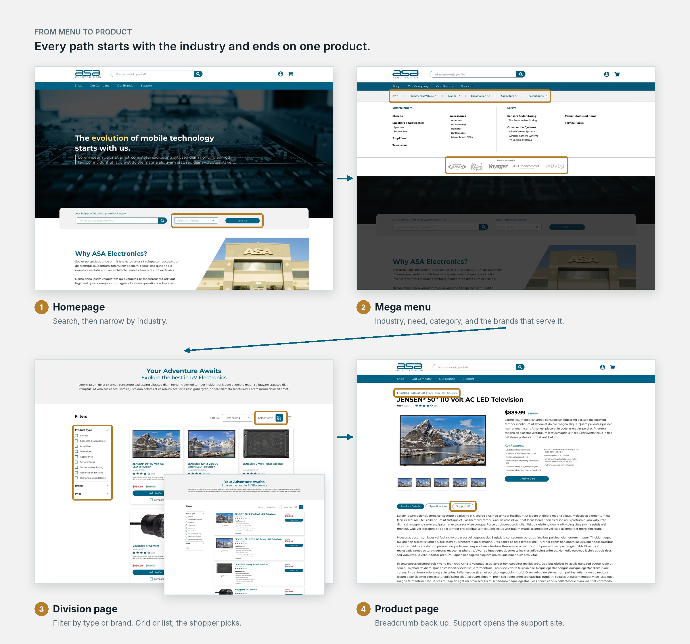
From menu to product Homepage, mega menu, division page, product page.
Exceptions and Tradeoffs
Not every site fit the pattern cleanly, and each exception was a deliberate call within the constraints.
- JENSEN: three brands, one site. JENSEN, JENSEN Marine, and JENSEN Heavy Duty had to share a single domain. I put all three in the primary navigation, placed the three logos side by side in the footer, and used broader footer labels, including About and Resources, to cover all three brands.
- iN·Command: shell first, redesign later. Scope ruled out a full redesign, so the site kept its legacy page layout but adopted the shared header and footer. This brought it into the shared navigation system and showed that the global layer could roll out ahead of page-level work.
- Legal links. I recommended consistent legal and opt-out links across every site. Leadership chose to defer that work, and I documented the gap.
Outcome
1
store and database for every brand
6
industries, shoppable across brands
<1 Day
per landing page, down from 2 to 3
The platform launched: one multisite carrying the corporate site, a dedicated support site, and the brand sites on one shared navigation system.
- Customers can shop by industry across every brand, on desktop and mobile.
- Sales and support now live on separate sites, each with a clear purpose.
- New and legacy sites share the same header and footer structure.
For the first time, every brand ran on one store, one database, and one analytics setup, making it possible to measure cross-brand behavior.
Landing pages: builds lasting from 2 to 3 days down to under 1.
Before the rebuild, every trade show or product page was hand-coded in HTML and CSS, including the mobile styles. On the new platform, I built a landing page template for each brand: show details at the top, then rows of featured-product slots that already worked across screen sizes.
Each template took a few days to build once, then got reused throughout the year. The payoff went beyond speed. Shows that never got a landing page before could now have one with little time invested. Building a page stopped being the slow part. Gathering show details and product information from sales became the main wait.
I left ASA shortly after launch, before post-launch analytics data was available. I designed toward lower bounce rates, better search visibility, and more cross-brand discovery. Those remained goals, not measured outcomes.
What I'd do now
Looking back with more resources and better tools, I'd push five things harder.
- Keyboard and accessibility. The mega menu was never verified for keyboard use. I’d design the focus order, open and close behavior, and screen-reader labels up front, then test against WCAG before launch.
- Components and tokens in Figma. The guides covered type, color, and buttons. I’d turn them into a shared component library with design tokens for each brand, plus spacing, grid, and breakpoint rules.
- Brand logos that go somewhere. The logo row in the mega menu shows which brands serve an industry, but the logos can’t be clicked. I’d link each one to that brand’s products in that industry, such as Voyager’s RV systems, to finish the discovery path.
- A Support tab that lands on the product. In the launched version, it opens the support site’s homepage, so the shopper has to search again for the product they were just looking at. I’d deep-link it to that product’s own support page, with its manuals and downloads ready.
- Success metrics before launch. I’d agree on targets for bounce rate, search traffic, and support contacts before design starts, so the results could be measured.
Visuals show my design mockups. The final build was handled by our agency partner, and some details differ from the designs.